What is the web going to look like in 2020?
Web design is never static and new trends pop up all the time. Now that we’re a few months into 2020, it’s time to take a look at the big web design trends for 2020. Is everything going dark with dark mode and even simpler with minimalistic design? And which of these trends will actually work in real world projects and which will never be able to move from concept to the real world of web design?
We asked our Gold Partners for help on what they were seeing so far in 2020.
The question we asked was:
“What do you think are the biggest web design trends in 2020?”
The web is going to get a lot darker… - Karl Tynan, Senior Software Developer at Rock Solid Knowledge
... if your user wants it to!
In recent months, there have been many iPhone and Android native mobile applications (such as Instagram and Twitter) that have developed a dark theme.
The latest mobile application to get a dark makeover in 2020 is WhatsApp.
A user can set their preference for a light or dark mode in their mobile device settings and, when the user accesses an application, it can use this setting to deliver a light or dark theme.
The good news is that this preference setting is not restricted to mobile applications! We can also use this same setting in the websites we build using cascading style sheets (CSS).
I spoke about some interesting front end tips and tricks at Umbraco UK Festival in 2019, where I demonstrated creating a dark theme for a website using CSS media queries:
.header {
background: white;
color: indigo;
}
@media (prefers-color-scheme: dark) {
.header {
background: indigo;
color: white;
}
}
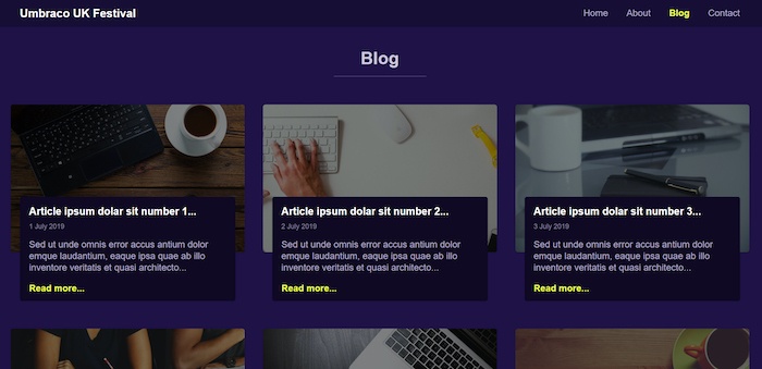
The media query for detecting a user’s colour preference can be used to style light and dark themes. It can also detect if the user hasn’t made a preference, or no-preference, on their default choice of colour scheme.
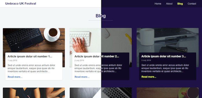
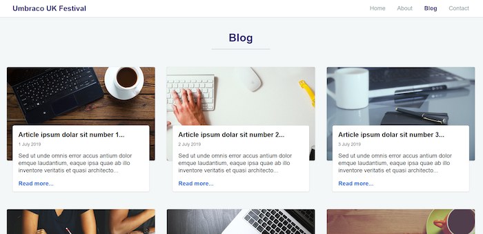
In 2020, most websites will hopefully default their colour scheme to match the user preference specified on their mobile device or operating system.
And remember, dark mode doesn’t mean grey, black, and dull websites… Try using darker tones or colours that will compliment the brand colours that you are working with.
Neumorphic design - Laurence Earl, UX & Design Manager at Prodo
Humans are a fickle bunch and web design trends tend to come and go – they’re always evolving but generally we see ourselves repeating history, albeit with a slightly new twist. In the early years of modern interfaces, it was all about skeuomorphic designs – things that mimic the look and feel of their real-world counterparts, like your desktop trash bin icon.
This shifted pretty quickly to more minimalistic designs, with the likes of Google, Apple and Microsoft quickly adopting it in their interface design. With super pared back, and textureless and flattened concepts we were graced with the likes of Google’s Material Design, a consistent design system devoid of any stitching to hold it in place. But one thing we’re seeing a lot of talk about in the design world for 2020 is the evolution of this concept – neumorphic design – taking a combination of the principles of skeuomorphic and flat minimalism with a pinch of clever shadow techniques to create a lifelike, elevated effect.
 Image credit: Dribbble user alexplyuto
The style adds depth and definition to previously flat shapes – it feels fresh and shiny, which is why it’s got quite so much attention. But we can’t help but wonder about the trend’s real world practicalities. It looks good in concept but one thing to always bear in mind with any new trend is its actual usability.
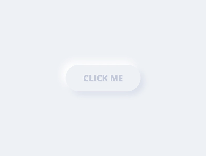 Image credt: Dribbble user Gabriel Bucur
Neumorphism struggles a little when it comes to accessibility with such low contrast ratios that can cause things like buttons to lose all definition so you need to consider colour palettes and enhanced contrasts.
Accessibility should arguably be the trend that stands the test of time – making sure that your design meets all the regulatory guidelines – things like alt text, contrast ratios and screen reader structuring need to be considered.
That’s not to say elements of neumorphism won’t filter through into plenty of designs this year, just in the real world it will more likely be ones that mix-and-match this effect with other styles. Trends are all about moderation, with equal importance placed on aesthetics, functionality and usability.
That’s all for this time! Thanks for reading and thanks again to our Gold Partners for contributing.