Advance
An Umbraco case study by Spring/Summer

🏆 Umbraco Awards won:
- Best editing experience
The Trouble
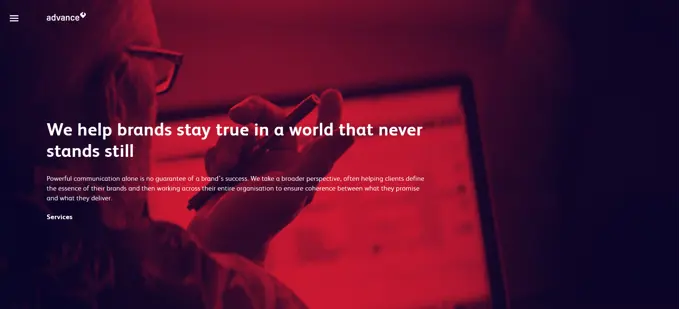
To accommodate Advance’s changing communication needs we, Spring/Summer developed a modular website where no page has a specific usage, but is instead defined by the content applied to it.
As part of the task Advance also needed to replace their intranet with basic news, address book and employee out-of-office functionality.


The Fix (es)
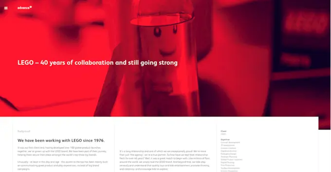
👉 Columns and modules. We created a front-end design system with three columns on desktop and two on mobile. The 3 columns are mostly used in a way where important content is located in the first 2 columns and then additional content in the third column. For lists, all 3 columns are used to maximize the overview.
👉 Modules are made as full rows, which makes it easier to understand the order that the content would be shown both on desktop and on mobile. This also keeps the configuration of a module to the bare minimum, since no layout configuration is needed.
👉 We focused on creating a simple editing experience that would still give the content manager the options that would allow them to construct a huge variety of content. Some pages have to tell a complex story, so we had to make it possible to group the content of a page into sections.
A section can have a label and a background color which helps identify where it starts and ends, and the section can be added as a bullet point in the bullet menu in the right side of the website.
👉 Structuring content. One of the big challenges was in relation to the structure of the content: pages contain modules that can be grouped into sections. To give the content manager a good overview of the content we needed to give an overview of the modules on a page, without hiding them inside the section they belong inside.
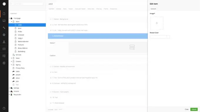
We came up with the solution of having all content in a one list. For that we used the package Nested Content. To give the content manager the feeling that sections are containing the modules defined beneath, we added a little extra styling to make sections stand out, giving them a different background color and some white space above to help indicate the separation.


"Focusing on the editor experience not only helped us creating a more simple back office but also gave ideas for smarter solutions in general,"
This gives a visual impression of the modules inside the section, even though they technically aren't.
We also enhanced Nested Content to give the editor a better overview. We reveal some values from the module in the list. In this way it's much easier to figure out which module you want to edit and to identify its location in the list.
We also changed the selected color so it matches the blue color we know from Umbraco, all of this together helps clarify what and where you are editing.
👉 Handling illustrations. Anywhere an image can be defined we abstracted the option and make it possible to decide between different types of media, either Image, Video or SVG.
The amount of data needed varies depending on which type of media, so we had to figure out a way to group these options and making them depend on the media-type.

Instead of adding another Nested Content, we used a new Package called Stacked Content, which is very similar to Nested Content except that the editing experience is moved into the sidebar. Since we made the active content item blue, and have the media editor in the sidebar, this way a visual reference is kept and that provides a better overview of where you are in the content.
We also enhanced Stacked Content by showing images in the background of an item, to make it clear which item contains what image.
The Joy
The new website is hosted on Umbraco Cloud, using Nested Content (manipulated version) and Stacked Content (manipulated version).
Using Umbraco Cloud we avoided having long training sessions and also limited the amount of questions in terms of how the back office works. It is just so intuitive for the content managers and this has really helped making the delivery easy for everyone.

"The back-end is really easy to work with from a content management and creation perspective. Because it's modular, it was really intuitive to get to grips with. We really wanted a 'living' site - something that is really easy to update and build on, and that's what this gives us,"