Asda Money
Enhancing the Asda Money customer experience
✅ clean & intuitive solution ✅ 109% increase in non-brand organic sessions ✅ significant improvement in bounce rates
Challenges & Goals 🎯
We, twentysix, needed to ensure this project improved site conversion by significantly enhancing the online customer experience and moving the Asda Money brand closer to the Asda “mother brand”.
Our objectives included:
👉 Creating a seamless customer journey and integration with third-party product partners
👉 Developing a flexible CMS solution, enabling internal teams at Asda Money
👉 Improve SEO performance and on-site conversion
👉 Enhancing data analytics and tracking to support insight-driven decision-making
A key challenge was creating a seamless customer journey. Conversions take place on multiple different third-party sites before returning the user to the Asda Money website. Our user journey and site implementation needed to be planned in detail to smooth this process.
Combining market research with insight from the Asda Money team, we worked to understand the audience triggers, mindsets, and motivations, we knew we needed to build brand trust with our audience. The findings fed into our UX and design planning to ensure that users felt reassured throughout their journey with the right information presented at key points of their decision path. We refreshed content on product pages to bring messaging more in line with Asda Money brand expectations and implemented an SEO strategy targeting customers based on buyer intent - providing them with a frictionless journey from search engine to conversion.
Our solution needed a CMS that would make a complex product set and operating environment simple to navigate and manage - a platform that would be highly performant and enable their internal teams. We, of course, recommended Umbraco.

How we made it happen
We assessed the impact of our designs and journeys using ‘first click’ testing to review new screen designs to make sure users could easily find what they were looking for. Tree testing allowed us to ensure the proposed new navigation was efficient in facilitating user journeys.
Our Umbraco implementation integrates with a wide range of third-party APIs to enable smooth journey flow. Content management controls make it easy for internal teams to create and update new and seasonally relevant content to help users navigate financial choices across a large variety of products.
Asda uses Microsoft Azure as their primary cloud provider, so in this instance, we also leaned into native Azure services such as Azure Cognitive Search and QnA Maker to ensure operational efficiencies whilst delivering innovative solutions.
Asda needed to be able to build out their guidance content for their customers in a way that didn’t require duplication of effort across multiple platforms. Combining their Umbraco platform with these Azure tools allows them to do this.
We delivered enhanced customer journey visibility by building a single data infrastructure encompassing all data points and customer journeys across the Asda Money website and third parties. This analytics overhaul will underpin the wider requirement of supporting data-driven decisions and enabling continued improvement via a conversion rate optimization program of work.


‘A clean, intuitive, and high-performing website’
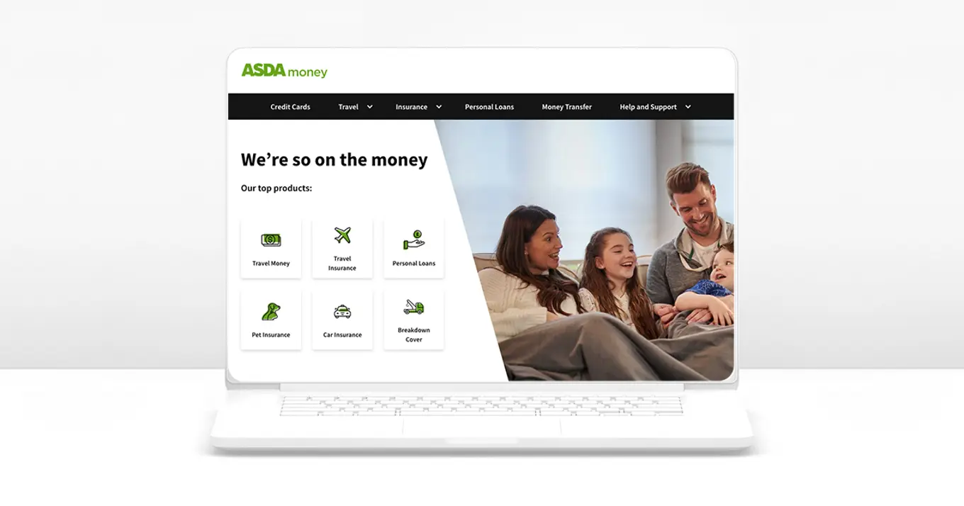
We delivered a clean, intuitive, and high-performing website designed with Asda Money’s customers in mind at all times. The implementation of enhanced analytics provided the brand with valuable marketing intelligence to drive ongoing optimization and improvements, to further enhance the digital experience.
Following the launch, Asda Money reported a 109% increase in non-brand organic sessions and a significant improvement in bounce rates across all key product pages.
