The Pony Club
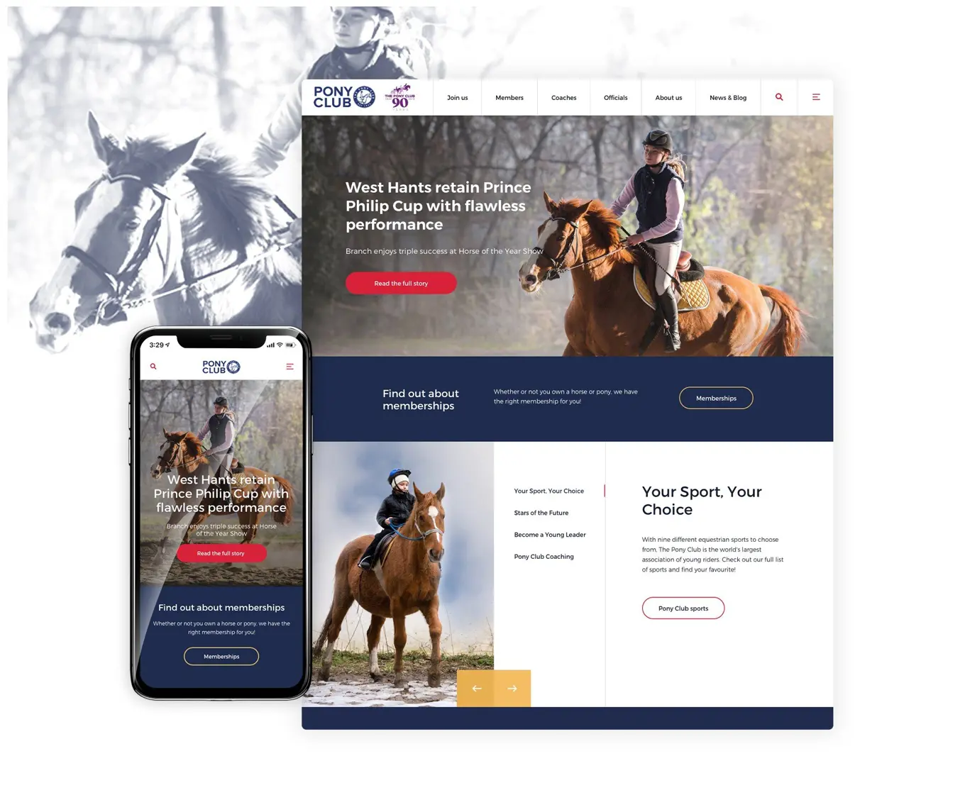
A mobile-friendly solution with an improved content structure and seamless user experience

About the Pony Club
The Pony Club is an international voluntary youth organisation for young people interested in ponies and riding. Tracing its history back to the 1920s, the club has been a stepping stone for a large number of equestrians and medal winners. Now with 345 branches and 480 centres in the UK alone, The Pony Club has over 110,000 members worldwide which makes it the largest young riders association in the world.
The Pony Club came to Spindogs when they realised that their website was no longer fit for purpose and needed a new updated look and feel. With three busy navigation bars and many conflicting calls to action on each page, the site offered a confusing user journey. This made it difficult for visitors to find the content they were searching for, which in turn meant The Pony Club were losing potential new member sign-ups.
They needed a review of their user journey and to use findings to build an engaging, accessible website that offered an improved user experience for all different Pony Club member groups. Following the creation of a clear user journey and navigation for users, The Pony Club also required a new content structure which they could easily follow.

Our Approach
Before we design any website, we conduct a series of discovery workshops that help us understand how users interact with the website and what their frustrations are. The Pony Club discovery phase confirmed that the website wasn’t user-friendly for new visitors. The busy navigation made it difficult for potential new members to sign-up and contact their local branch or centre, which resulted in a large volume of enquiries sent to The Pony Club HQ and a lot of extra work for their staff there.
We also found the website's catalogue of content was buried deep in the website with poor navigation which made it difficult for visitors to find the content they wanted to see.
Following the workshops, we delivered a discovery blueprint, which set out our recommendations for the new website.

“We wanted a website with a modern style that would engage with The Pony Club members and all our different stakeholder groups. Spindogs' design experience was invaluable and the regular project meetings allowed us to effectively communicate feedback and ideas.”
Making sure our clients have the right content management system (CMS) is an essential part of the process for any website we build as we need to be confident that the CMS can fulfil their business objectives and aims for the future. This is where we identified Umbraco to be the perfect solution.
We worked with The Pony Club to confirm what functionality they wanted for their website from the get-go, as well as a wish list of features for later down the line. Based on their goals, we decided that Umbraco would be the best CMS for The Pony Club as it would allow them to create microsites for individual branches and centres, should they wish to expand their website in the future.
Our Solution
We always have our UX hats on during the design stage of a project. When we were designing the new website for The Pony Club, we did so with a clear user journey and content structure in mind, aiming to create something that would guide potential new members to the content they need and encourage them to sign up.
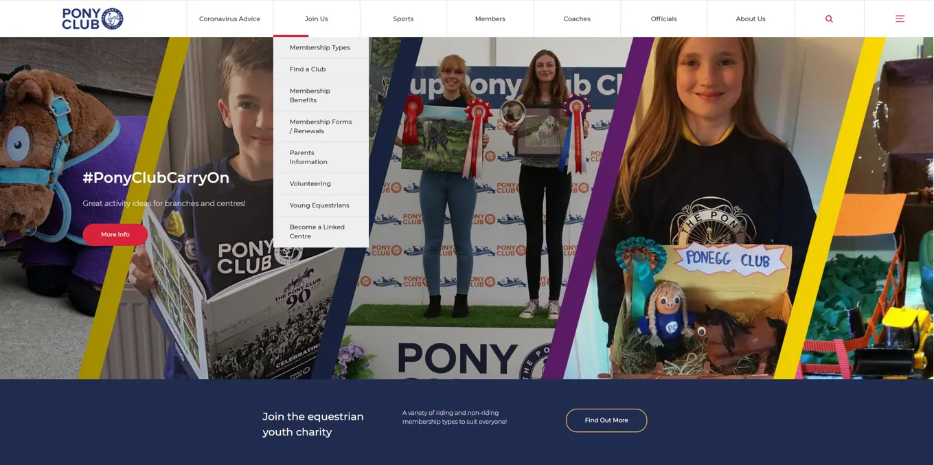
We started by consolidating the three navigation bars into one clear bar at the top of the page. We then created an additional burger menu, which could house any content that did not fit the categories in the main navigation.
With the help of the new CMS, The Pony Club could map content appropriately, doing away with duplicate content from their old site, which in turn helped create an easy-to-follow structure.
Faced with the challenge of enabling members to easily find membership details on the website, our designers and frontend team worked together to create a ‘decision tree’ on the membership types page. The drop-down form with three simple questions was designed to determine the user’s membership type. Once they have answered the questions, the system highlights the most suitable membership option on the right-hand side of the page.

We also created a call to action for the page, designed to drive potential members to sign up for the correct membership. The call to action encouraged the users to enter their postcode or a specific centre/branch, and then points them to their nearest ‘Pony Club’. As well as ensuring users could easily get to the relevant contact information, we also simplified the site search by adding filters to take members to their desired destination in fewer steps.
Finally, to tackle the issue of users contacting HQ instead of their local branch, we created a dedicated ‘Find a Pony Club’ page. The simple layout, combined with Umbraco’s sophisticated tagging functionality, enabled users to easily find the contact information for their local Pony Club without going through HQ. We used the same tagging functionality for the ‘Latest News’ page, so that visitors can sort news articles by sport type. In the future, we anticipate this functionality will also allow The Pony Club to tag their news content by specific centre and branch as well.

Design Highlights
✔️ New navigation and burger menu – Consolidated the three navigation bars into one main navigation, plus a burger menu which sorts content by topic.
✔️ Drop-down form for members – Created a drop-down form on the membership types page to help users find the most suitable membership for them.
✔️ Mobile responsive – Made the new site mobile-friendly so that members could seamlessly access the website on their phones when they are out and about.
✔️ ‘Find a Pony Club’ page – Designed a dedicated landing page for new members, so they can find their branch contact information without having to get in touch with the head office.
The Results
The end results? A mobile-friendly website with an improved content structure and seamless user experience, which enables The Pony Club members to find their membership details and local branch information with ease.