Update 03-02-2023: Part 2 of the Deep Dive: Block Grid Editor series is published.
The Block Grid Editor is a new Property Editor for Umbraco CMS. It provides a new editing experience a common built on the same principle as the Block List Editor. Common for the two is they use Element Types as the basis for storing data as Blocks.
Why a Block Grid
Introducing the Block Grid Editor serves multiple purposes.
- We wanted to improve the existing (and very popular) Grid Layout Editor both in terms of development and editing experience.
- By basing it on the Block Editor technology, also used for the Block List Editor you get many of the same tools, can use the same conventions, and we have a more aligned set of Property Editors.
- With a new backoffice tech stack in the works, all Property Editors need to be migrated, and/or rewritten. Updating the Grid Layout Editor was a big task and it made sense to go back to the drawing board and cover the needs with a better technological foundation.
This resulted in a feature proposal published on the Github discussion board, and we received a lot of great feedback that helped shape the editor. This trend continued with the release candidate periods where users could get their hands on the Block Grid Editor - a wealth of comments and suggestions for how we could improve and tweak both the editor and developer experience.
So, before we dive into what the new editor provides, a huge thank you to everyone who has helped out with comments and contributions - HIGH FIVE YOU ROCK 🙌
Structure and Layout Capabilities
The Block List Editor, launched in Umbraco 8.14, enables content to be stored as a list Blocks. The Block Grid Editor structure uses the same basic structure and enables two additional layout options which can be configured and composed for your needs.
In its most simple form, the Block Grid Editor provides a list of blocks very similar to what is achieved with the Block List Editor.
The structural capabilities can be thought of as columns and rows and are stored as metadata for the Block itself. By adding layout information it is possible to provide a better representation of content in the Umbraco backoffice, as well as help inform how the Blocks should be rendered in the front end.
Block Size
The default configuration for the Block Grid Editor is a 12 columns grid, and all new Blocks created will take up a full row. This can be changed by defining how many Columns a Block spans.
In other words, spanning the full width is equal to spanning 12 columns, and you can define and configure the size for a given Block. By doing so you provide the editor with a new default.
A Block spanning 6 columns, will leave 6 columns for other Blocks to occupy.
In this way, we have enabled putting two Blocks on the same row.
A combination of full-width (12 columns) and half-width (6 columns) Blocks.
Additionally, a Block can be configured with multiple allowed sizes, enabling the content editor to resize a Block for the desired presentation.
Block Areas
It is also a common need to provide fixed layouts, establishing a more rigid structure for content, and in many cases, this can be a big help for content editors. A typical use case is a two-column layout.
To achieve this you can use the new Block Area feature. An Area is a container that can hold multiple Blocks. Areas are arranged to form the desired layout, providing a predefined fixed layout for Blocks to be placed within.
Block Areas are configured on a Block Type, making a Block the container for multiple other Blocks.
Editing Capabilities
Another area (not capitalized 😉) that has received significant improvements compared to the Grid Layout Editor is the editing experience. As the Block Grid Editor is based on the Block Editor technology, you’ll see many of the tools and conventions for how you can create and manage content are also available here.
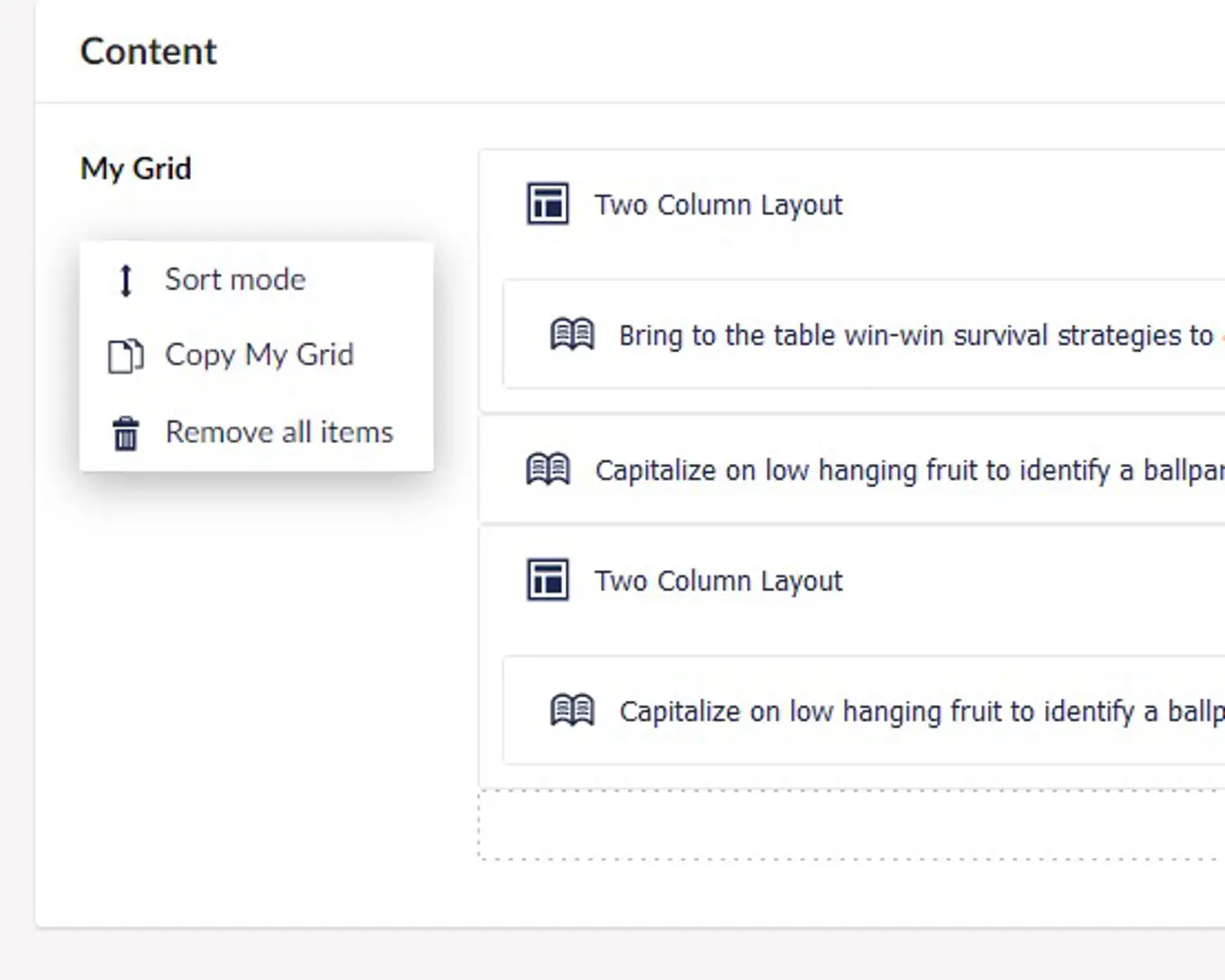
So, you can now insert content between Blocks, copy/paste Block content with built-in clipboard functionality, and use Property Actions such as Copy All and Remove All items.
And there are new features added specifically for the Block Grid Editor as well. As mentioned above, you can enable re-sizing Blocks. This means there are new anchors in the UI indicating that you can simply click and drag to resize this content. You’ll also notice that the UI for selecting Blocks is similar to the Block List Editor and now you can even group Blocks to make it even easier to navigate.
As everything is based on Block Types (Element Types), you have the full range of Property Editors available to tailor an editing experience to very specific needs, and of course add Settings to Blocks as well.
In short, you have all the tools available to create a great editing experience
Tutorial: Setting Up a simple Grid
Let's go through the steps to configure the Property Editor. First, we will set up a Block to hold some basic content, and later we will set up a Block to provide a two-column layout.
In the following video, I will show how to set up a new Document Type with Template, adding a property to use a new Data Type of Block Grid Editor.
Notice the configuration of Grid Layout Columns defaults to 12. Make sure to align the number of columns with your front end.
Tip: You can add sample configuration when creating a new Block Grid editor Data Type. It adds some simple Blocks and lets you try things out quickly. For the purpose of this article, we will not be using the sample configuration.
Defining a Content Block
For this Block Type we will choose to create a new ElementType, with the name “Rich Text Block”, this should house a property named “Rich Text” using the Rich Text Editor DataType. You can of course compose your Element/Block Types with multiple properties if needed, and add additional settings as well.
We will just add a label of:
and leave the rest of the configuration as it is.
Tip: Label templates can be a powerful tool when creating a good editing experience. You can learn more about Label Templates in the documentation.
Defining a Layout Block
A Block Type has to be based on a unique Element Type, therefor we will create a new Element Type for this Block as well, using the name “Two Column Layout”. We will not add any properties as we don't need any data for this Block.
For this Block Type configuration, we will jump straight into the configuration of Areas.
On this screen we configure Areas and the layout of these. Initially, the layout of Areas inherits the number of columns from our root layout configuration. For this one, we are happy with 12 columns so no need to adjust this.
When setting up a specific Area it's configured to span half the columns of the layout. In this case, we are good with 6 columns out of 12. The Area size can at any point be changed by dragging the scale handler in the bottom right corner, and Areas can be moved around to the desired order.
Each Area has separate configuration and requires an alias. I want the first one to be named “left”. Leave the rest of the configuration as-is.
Let's add one Area, and have a look at the configuration of this.
Let's add another Area and give it an alias of “right”, again using the default values for the rest of the Area configuration.
Organizing Blocks with Groups
Now that we have multiple Blocks, of different types (content and layout), it can be useful to start thinking about how to present these to an editor in the best way. With the Block Grid Editor, you get the ability to create Groups that you can sort Blocks in to. In this tutorial you can add a Content Group for the Rich Text Block and a Layout Group for the Two Column Layout.
Now they will be presented a little differently, sorted under the Group label when creating content. Maybe slight overkill with just a few Blocks - but it quickly becomes very a useful tool.
With all this in place we are ready to start creating some content with the Block Grid Editor. Let's try it out!
Creating Content with Blocks
In the Content section create a new Document based on our Document Type to see what we have established.
When adding a new Block we can choose both Blocks as they both allow to be created at root.
Let's add a Rich Text Block to see how that looks.
Afterwards let's create a Two Column Layout Block.
We can now create content within the two-column layout or choose to move some of our existing Blocks into this.
Now we should have structured content created in the backoffice.
Render Content from the Block Grid Editor
In order for this structure to bring value to our website we need to render it in a similar way on the front end.
Styling the Front End
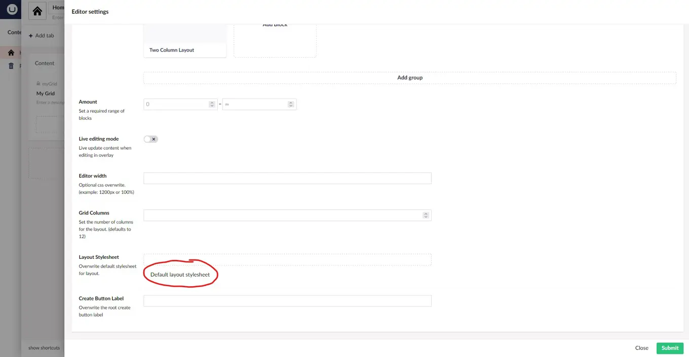
First, let's open the Data Type again. Here we can actually retrieve the Default Layout Stylesheet that is being used to render the Block Grid Editor in the backoffice.
We will download this and place it in “wwwroot/css/” to make it available for our front end. In this case I'll simply copy/paste the CSS into a stylesheet created in the backoffice with the name blockgridlayout.css.
In our Razor template, we must include the stylesheet:
<link rel="stylesheet" href="@Url.Content("~/css/blockgridlayout.css")" />
Tip: We can change this file and adapt it to our needs, even rewrite the CSS entirely. And, what's really great is, you can use custom stylesheets for the backoffice as well. On the Data Type configuration you choose what stylesheet to use, thereby overwriting the default one.
Rendering Block Grid Content
At the location where we like to render our grid we insert a call to the build-in render method:
@await Html.GetBlockGridHtmlAsync(Model.MyGrid)
With this in place, we can see the Grid, but we still miss the rendering of each block.
Rendering Individual Blocks
For each Block we need to write a Partial View and locate it in this folder: “Views/Partials/blockgrid/Components/”
In the next blog post, I will cover writing Partial Views for the Block Grid Editor. But in this, I will give you the code for both views:
If we look at the website we will now see this:
And that's it. You have just set up your first simple Block Grid Editor.
This is just the beginning
I hope this gives you a good starting point for working with the Block Grid Editor. You can expand on the example we’ve made, try adding new properties, different size options, and Area configuration, and get a feel for how it all works.
There is a lot more to explore and in upcoming articles we’ll dive further into features and configuration that can help you tailor the experience to fit the needs of your projects - and make your editors happy.
Update 03-02-2023: Part 2 of the Deep Dive: Block Grid Editor series is published.
If you want to learn more, now, there is extensive documentation for the Block Grid editor, that covers everything from the very basics to a fully customized editing experience. We have also created an advanced example website, for your inspiration, that shows off a backoffice with custom views. So there’s plenty to (deep) dive into, whether you’re completely new to blocks and grids, or you already have a good grasp of the concepts.
We are thrilled with the buzz surrounding the new Property Editor and can’t wait to see what you create with it.