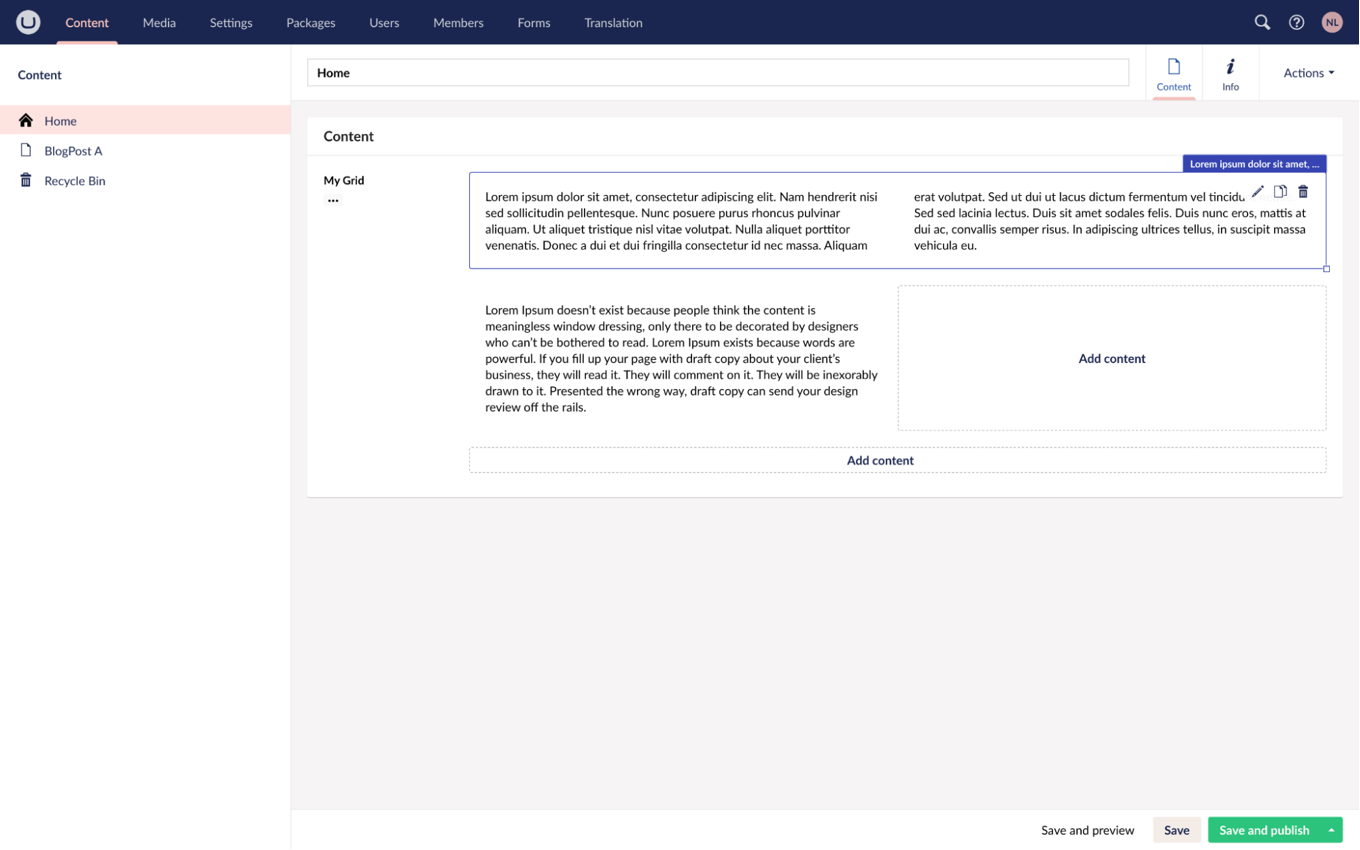
Umbraco 11 Login Screen Illustration 1900X1128px

Deep Dive: Block Grid Editor Part 3

Utilizing Contextual Data to Enhance Block Styling

Niels Lyngsø
Written by Niels Lyngsø

When designing web pages, or creating content as an editor, selecting appropriate colors can significantly impact the overall user experience. By leveraging contextual data, we can dynamically adjust the appearance of different elements based on their surroundings. In this article, we will explore how to employ Custom CSS Properties to create visually adaptive Blocks for the Block Grid Editor.

As the title suggests this is part 3 of the series where we dive into the features of the new Property Editor for Umbraco. In this article, we will continue the work from parts 1 and 2, so if you want to follow along I highly recommend reading and completing the tutorial in Block Grid editor part 1 and Block Grid editor part 2.

A Little Context Goes a Long Way

In part 1 of the series, we discussed some of the differences between the Block List Editor and the Block Grid Editor, the main one being the ability to control and manipulate the layout of the Blocks.

Block Grid Editor List Vs Layout 1781X875px

This is not only useful as a visual guide and layout tool for editors but also provides contextual data. As a developer, you can use this data to inform how things should be rendered on the front end and, importantly, also when implementing custom views in the backoffice.

With the Block Grid Editor, we’ve made it easier to achieve goals that were previously only possible by appending additional data. Consider, for example, adding Settings to choose how text and buttons should be aligned, what color they should have, padding, margins, and so forth. These tricks are necessary when using something like the Block List Editor, or even the old Grid Layout editor, as you don’t have much or easy access to the layout data.

Note: This is not to say that adding Settings where content editors can control visual appearance, responsive behavior, and more, is a bad idea. It can be very helpful to have manual control or overrides, for these things. But in many scenarios, we can help by providing sensible defaults, or simply ensuring that Blocks look good in all the possible combinations. If we can help editors create content with a good look and feel, and less mandatory configuration along the way, that’s surely a good thing. Some might even call it friendly. 

With the Block Grid Editor, we are able to nest Blocks in Areas. This means we are essentially creating Blocks in the scope of the parent Block, and have access to the layout data for all the Blocks in this scope. With this information, we can change the visual appearance depending on the parent Block, the current Block, or a combination of the two, in our views - in the backoffice and on the front end.

And that’s what we’ll investigate in this article.

Using the Block Size

In the following example, we will change the visual appearance of the Rich Text Block depending on its size. Specifically, we want to break the text into two columns when the Block is full-width (12 columns wide).

There are multiple ways to do this: We could set an extra class, add an attribute, or set a CSS Custom Property.

The size (columns and rows) of a Block is not part of the Content Element or Settings Element but rather is part of the Layout data for the block, and this is what I’m referring to as “contextual data”.

{
    "layout": {
        "Umbraco.BlockGrid": [{
                "contentUdi": "umb://element/bb23fe28160941efa506da7aa314172d",
                "settingsUdi": "umb://element/9b832ee528464456a8e9a658b47a9801",
                "areas": [],
                "columnSpan": 12,
                "rowSpan": 1
            }, {
                "contentUdi": "umb://element/a11e06ca155d40b78189be0bdaf11c6d",
                "settingsUdi": "umb://element/d182a0d807fc4518b741b77c18aa73a1",
                "areas": [],
                "columnSpan": 6,
                "rowSpan": 2
            }
        ]
    },
    "contentData": [{
            "contentTypeKey": "0e9f8609-1904-4fd1-9801-ad1880825ff3",
           "udi": "umb://element/bb23fe28160941efa506da7aa314172d",
            "title": "Item one",
            "text": "This is item one"
        }, {
            "contentTypeKey": "0e9f8609-1904-4fd1-9801-ad1880825ff3",
            "udi": "umb://element/a11e06ca155d40b78189be0bdaf11c6d",
            "title": "Item two",
            "text": "This is item two"
        }
    ],
    "settingsData": [{
            "contentTypeKey": "22be457c-8249-42b8-8685-d33262f7ce2a",
            "udi": "umb://element/9b832ee528464456a8e9a658b47a9801",
            "featured": "0"
        }, {
            "contentTypeKey": "22be457c-8249-42b8-8685-d33262f7ce2a",
            "udi": "umb://element/d182a0d807fc4518b741b77c18aa73a1",
            "featured": "1"
        }
    ]
}

Example of how the data for the Block Grid Editor is stored. Notice the Layout property holds information about the size of the Block in columns and rows, as well as any potential Areas.

We can use this to our advantage in custom views. Let’s add this line to the div of the Rich Text custom view. This will set the CSS Custom Property to either 1 or 2, depending on the size of the Block:


App_Plugins/MyCustomBlockViews/richTextBlock.html

Note: In Partial Views, we can get the ColumnSpan or RowSpan directly from the Block model in a similar way:

style="--my-rich-text-columns: @(Model.ColumnSpan == 12 ? "2”": “1”);

This will not make a difference until the CSS Custom Property is used.
Here I use it to set the columns and add some space between the columns.

css/blockgridlayout.css

To get a proper responsive behavior I will wrap the style from above in a media query, in this way there will only be two columns on a bigger screen.

css/blockgridlayout.css

With this done, we can now see that a Block spanning all 12 columns will split the text into two parts. If the Block is moved or resized and is no longer spanning 12 columns, the text will display as a single column automatically.

In this way, the Block adapts to its usage, in other words, it is now contextual.

Block Grid Editor Dynamic Columns 1999X1250px

Using parent context

In the Block Grid Editor, we can easily move a Block from one parent Block to another, when doing so we can make it adapt to the new context.

In this section, we will make a Call to Action button that visually adapts to its surroundings. The goal is to ensure that the button has a good contrast with the background, and follows the design. If the button is placed on a white background it should have a dark color. In the same manner, when placed on top of a dark background it should have a light color.

Block Grid Editor Call To Action Buttons 1999X1250px

Again, we could use the approach of manually choosing the button's color by adding a toggle via Settings. This works but also allows for mistakes and requires action from the content editor. Let’s provide a better experience by using contextual data to choose the color. 

In this example we will add a new Block; let’s name it Call To Action Block. We’ll add a property with the alias ‘link’ and use the MultiUrlPicker Property Editor.

For the custom view, I will be using this code:

App_Plugins/MyCustomBlockViews/callToActionBlock.html

And I will append this to the stylesheet.

css/blockgridlayout.css

Block Grid Editor Call To Action Button On White 1999X1250px

To create a scenario where the colors of the buttons can be affected by the parent Block, I will add the ability to set a background color on the Two Column Layout Block.

First I will add a Color Picker Property on the Two Column Layout Element Type, with the alias ‘backgroundColor’.

Then correct the Custom View of two Column Layout to this:

App_Plugins/MyCustomBlockViews/twoColumnLayoutBlock.html

This markup sets a dark-condition attribute when the background color is set and it's not white. I will use this attribute to set a CSS Custom Property.

With this in place, I can set a background color, and get this view:

Block Grid Editor Call To Action Button On Blue 1999X1250px

Let's enable nested Blocks to adapt visually to the dark background.

CSS Custom Properties pierce ShadowDOMs, meaning it will affect child Blocks. This is our way of communicating to child Blocks. Generally, the modern way to communicate down the DOM.

We could be defining two explicit CSS Custom Properties directly here, like this:

css/blockgridlayout.css

But we will not do this. Instead, I will introduce a trick where we will use a single CSS Custom Property as a condition, this will help separate the concerns of our styling. Leaving the Two Column Layout with no knowledge of how Blocks adapt to this condition — which is a good thing. (If you want more info check out the The CSS Custom Property Toggle Trick article)

I will add this part to the stylesheet:

css/blockgridlayout.css

By setting --my-dark-condition to an empty space, we can use that as a condition for local properties. In this way, the layout does not need to know anything about the actual colors.

Now let's use the CSS Custom Property to change the Call To Action appearance when it's placed on a dark background.

For this, I will change the class of ‘my-call-to-action’ to this:

css/blockgridlayout.css

What happens technically is when ‘--my-dark-condition’ is set the value becomes valid, otherwise the value is invalid and it will use its fallback value.

In this way, we made a contextual Block that changes its appearance depending on its surroundings.

Web Components for reusable markup

In these examples, I've used the same stylesheet across the front-end implementation and the backoffice custom views while the HTML is written twice in both our custom and partial views.

To make things more maintainable we can use web components. This can be achieved either natively or with a framework.

A web component is a bundle of HTML, CSS, and JS that is natively supported by browsers.

It enables us to write the markup, CSS, and JS of a Block and use it both in the front-end implementation and the backoffice.

The web component approach would minimize the part of a custom view to the data-binding, though the amount of markup in the above examples is very low. I will bring you a sneak peek of how the implementation of a web component could look like, using the Rich text Block as the example:

As you can see, the styling would be handled by the web component, making it unnecessary to define a stylesheet for each Block.

Here is a list of libraries and frameworks that can help you get started: https://webcomponents.dev/new.

The Umbraco UI Library, which now ships with Umbraco, is built with web components and can also help serve as inspiration. 


I hope this article provides inspiration for how a little data can be utilized to make life easier for content editors. It can help ensure consistency with good, dynamic, defaults, and minimize the number of choices an editor is required to make.

This is one of the many benefits of going to the Block Grid Editor as opposed to Block List, or older technology.

Hope to see you at Codegarden and have fun customizing the Block Grid Editor 🙌

Loved by developers, used by thousands around the world!

One of the biggest benefits of using Umbraco is that we have the friendliest Open Source community on this planet. A community that's incredibly pro-active, extremely talented and helpful.

If you get an idea for something you would like to build in Umbraco, chances are that someone has already built it. And if you have a question, are looking for documentation or need friendly advice, go ahead and ask on the community forums.

Want to be updated on everything Umbraco?

Sign up for the Umbraco newsletter and get the latest news and special offers sent directly to your inbox