Investor
A modern and very user-friendly website built on Umbraco Cloud

Investor - Building great companies since 1916 🙌
Investor is an investment company founded in 1916 by the Wallenberg family and is the largest owner of the Swedish stock exchange. Their business philosophy has been the same from the get-go - to invest in companies and actively contribute as a leading shareholder to their long-term success.
The successful business counts 102 years of building best-in-class companies and was recently in need of a modern, upfront and trustworthy website that better characterizes what they do and stand for. It was essential for Investor to provide a top-notch user experience; so that everyone, from owners to employees and other stakeholders, could easily find what they’re looking for.
And, we, Limetta, achieved exactly that by building a brand new website for Investor on Umbraco Cloud.
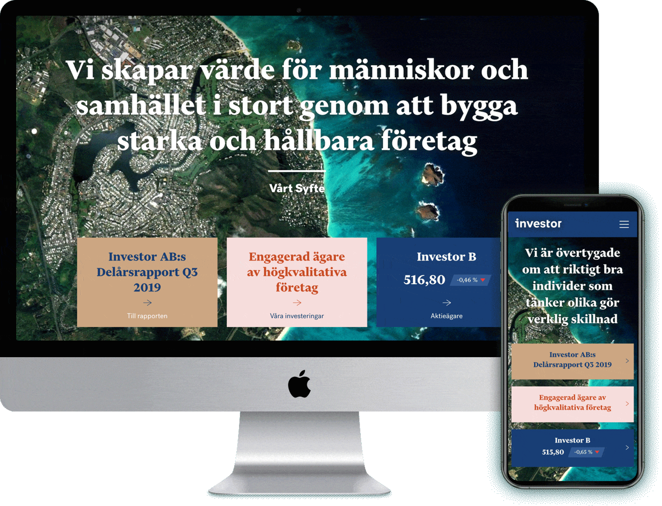
The way towards a brand new website 🤩
Let’s take it from the very beginning. It all started with a wondrous workshop to get a better feel of the objectives and what was important for Investor in the project. Time was a major factor, so we agreed that the project would be iteratively conducted.
As for the design, we had to find a balance between being professional and transparent, but also human and inclusive. At the same time, it was crucial that the website had a clear and distinctive visual identity.
All in all, Investor desired a website that’s professional, bold, while simultaneously being functional and easy to navigate.
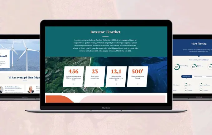
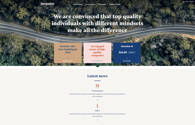
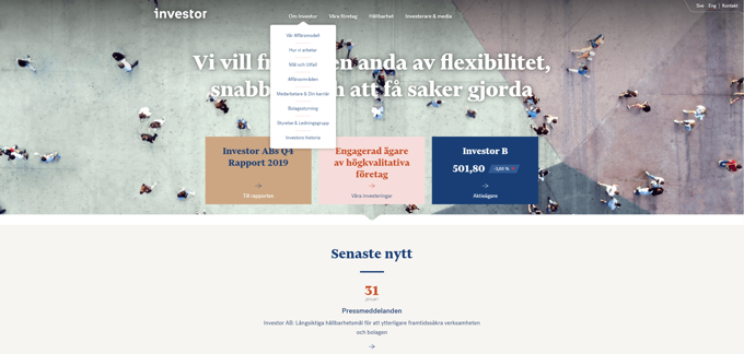
To make this happen, we emphasized the importance of achieving harmony through colour and heading, adding life and movement through large, trustworthy images with a top-down perspective.
We also wanted to make it easier for the user to find what they’re looking for by developing an efficient structure with clear and intuitive navigation.
A wide colour palette with both warm and cold colours facilitated the work of carving out a bold, versatile and clear visual design.
Getting it done with Umbraco Cloud 💪
Based on a data-driven needs analysis, we effectively covered the users' needs through clear and flexible inputs on both the home page and other pages as well as in the framework.
New reports automatically end up as a priority entry on both the home page and as a graphic push in the footer. And the most sought-after content, Investor's holdings (the companies included in Investor's portfolio), are always easy for the user to reach.
To ensure the best possible operating environment, we chose to host the site on Umbraco Cloud.
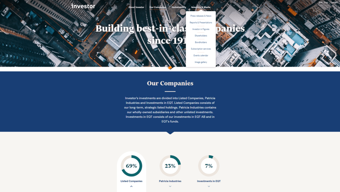
The benefits of Umbraco Cloud are many:
👉 It is easy to push content between environments. For example, you can build a new part of the pages in Staging and then simply ''copy'' over to the Live Environment.
👉 It is easier to make deployments/releases between different environments.
👉 We can focus on developing Investor's presence instead of spending time and effort on updates and keeping the servers up to date.
Happy End: a very user-friendly website ✨
The result of our joint collaboration is a modern, functional and easily accessible website where visitors have the opportunity to immerse themselves in both structure and content.
With clear navigation and structure, we have made sure that relevant information is in the right place. The varied layout and design make it easy for the user to get an overview and quickly find what they're looking for.
And that's how a beautiful and user-friendly website for Investor was born 👏 All built on Umbraco Cloud, powered by Limetta 💗
