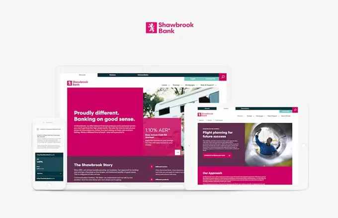
Shawbrook Bank
Building a stronger brand and a more effective digital experience

Look at the post-launch performance numbers 🤩
The case
Shawbrook Bank was set up in 2011 with the aim to serve the needs of individuals and SMEs (small and medium enterprises), especially those who cannot obtain finance from the main commercial banks. The bank was founded by Pollen Street Capital, formerly a part of Royal Bank of Scotland, before being floated on the stock market in 2015.
Mission: complete rebrand and rebuild
Shawbrook was primarily an intermediary driven bank and the old website was built without the need for large amounts of direct traffic. Today, Shawbrook is more evenly split between B2C and B2B sales with the ambition to significantly increase direct website sales and leads.
This formed the need for a redesigned website, as well as a complete rebrand. The ambition was to provide a platform to increase website sales across Shawbrook’s consumer range of savings and loan products and to advertise and promote their business products.


Setting out to work: mobile first
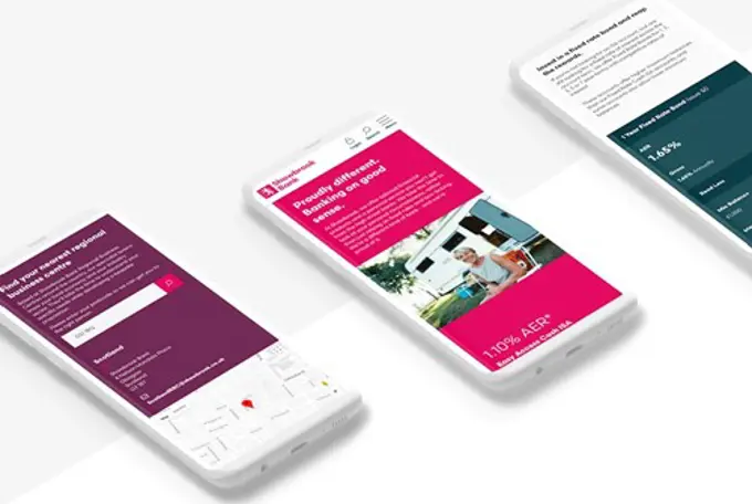
We implemented a modular mobile-first solution following best practices and aligning with a design system that had a distinguished approach to leading the customer through key steps towards their goals.
The design approach was unique in that we were concurrently rebranding the business during the early stages of the project. We, therefore, were required to work iteratively to make sure the emerging brand thinking was expressed in the new digital experience.
Our analytics team ensured that data-led insights were woven into the project from measurement to optimisation and evolution. By enhancing the analytics set up we delivered the critical element of data reliability to better meet Shawbrook’s measurement and analysis needs.

The journey: how we did it
Our collaborative team included UX design, engineering and writing to present the content in the best way possible and fulfill the various objectives of the new Umbraco site. Development of considered micro-interactions and transparent/positive copywriting, all contributes to an intuitive and engaging user experience.
Key journeys on the website were user-tested to verify the design and strategic thinking.
This provided an understanding of what information and features different users were looking for at each stage of their journey - from first impressions and common actions, through to their desired outcomes.This ultimately allowed us to identify any areas for improvement early in the project.
During the build, technical SEO best practice was followed and we conducted an in-depth Search Trend Analysis to ensure the content on the website was optimised for launch.
Shawbrook now stands proudly tall
Since launch Shawbrook’s new website has resulted in a 70% increase in mobile traffic and a 41% increase in total organic traffic. We have significantly increased awareness and user engagement, and the growth in mobile traffic clarifies our mobile-first design approach.
But that’s not even all. Thanks to the new Umbraco-based website there was:
👉 39% increase of sessions;
👉 28% increase of PDF downloads;
👉 371% increase of engagement with business contact no. pages;
👉 -27% bounce rate drop (indicating stickiness of site).
Shawbrook now stands proudly tall in a concentrated market of specialist banking and remains an authority in business, intermediary and personal banking.
Discower how your business can benefit from Umbraco
Let us show you how you can focus on all the fun stuff with Umbraco Cloud. If you want to see Umbraco Cloud in action, let us talk, and show you how your company can benefit from using Umbraco Cloud.
Book a live demo to see how your business can benefit from Umbraco

