Trygghetsfonden TSL
A friendly and functional website for Trygghetsfonden TSL

About Trygghetsfonden TSL
Trygghetsfonden TSL is an organization that is active in the Swedish labor market helping unemployed workers transition to a new job or profession by providing coaching, education, and financial support. It's owned by the Confederation of Swedish Enterprise (Svenskt näringsliv) and The Swedish Trade Union Confederation (LO).

What was needed for the new website?
Trygghetsfonden TSL needed a modern website that could better cater to the needs of its users. They also wanted the new website to be seen as a safe and friendly hub where they can reach out to workers who recently lost their jobs and help them transition into a new job or profession. The new website should be a supportive tool throughout the transitioning process rather than just being a funnel that catches people only to see them disappear to other places, as was often the case with the old website.
Through workshops and interviews with users, we identified some key issues that we needed to address. Users found the old website hard to navigate and the layout somewhat unstructured. The visitors didn't get a clear picture of what Trygghetsfonden TSL is and how they could help. To provide the user experience that Trygghetsfonden TSL was aiming for, they needed improved content and better tools that allowed for more flexibility when creating page layouts as well as clear guidelines regarding the structure of the content.

How we made it warmer, friendlier and easier
We used Umbraco to build an administrative interface that provided both the flexibility and the structure that Trygghetsfonden TSL needed when creating pages and providing content and SEO. We also created an intranet for Trygghedsfonden TSL with a login feature that is built using Azure AD Single Sign-on. Since both the internal and external platforms are hosted on the same platform it is easy for editors to reuse content between the platforms. When the new external website was ready to launch all the pages from the old site were redirected to the new pages using Umbraco and 301-redirects, which meant that they could keep their search engine ranking.
Results that speak for themself
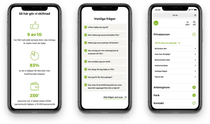
By creating a new design that uses images of real people in real environments, a warm and positive color palette and friendly but straightforward headlines and texts we were able to create a much more warm and welcoming website. A well-thought-out structure and navigation guide the users to the information and functionality they need. Key user journeys are supported using quick links and distinct calls to action. The overall impression is a functional, modern website that reaches its target audience.
Umbraco provides an easy-to-use interface for administrators through which they can update the content of both the public website and their intranet.


